The Dark Side of PowerPoint Charts in the GenAI Era
« According to your PowerPoint, 10.5% of Japan’s population is Gen Z » – ChatGPT, probably. Ever wondered if your AI assistant might be having a sugar rush from all those donut charts you’ve been feeding it? In a rather disturbing experiment, I asked the world’s leading AI models (ChatGPT-4, Claude, Copilot, and Google’s Notebook LM) to extract simple demographic data from a market study. The results? Let’s just say they turned PowerPoint charts into a game of « Stochastic Telephone. » Spoiler: They all confidently provided answers. They all referenced the correct page. And they were all… spectacularly wrong. In this post, I’ll share why your beautiful charts might be creating a corporate hallucination factory, and why this matters more than ever in the age of AI-powered document search. Before banishing Powerpoint, there might be simple solutions.

Words have meaning. And charts in PowerPoint presentations can carry quite misleading ones when processed by our newest AI companions. Let’s dive into a rather disturbing experiment about how Generative AI interprets visual information from corporate presentations.
Among the countless promises of Generative AI lies the ability to retrieve information from documents – PDFs, PowerPoints, Word files, you name it. Through a chatbot interface, users can ask questions, and the relevant information is retrieved from the knowledge base. The underlying technology, RAG (Retrieval-Augmented Generation), enhances Large Language Models by feeding them relevant context from a document collection before generating answers.
In the corporate world, information primarily flows through PowerPoint slide decks. While this might suit presentation needs, these documents are increasingly becoming sources of information for AI tools. Even more concerning, as these tools become widely available, we’re promised the ability to tap into thousands of documents for insights. And since these documents can be produced at a blazing pace, we’re heading into a frightening spiral.
Let me share an experiment that might make you reconsider how you present data in your next deck.
The Experiment
We fed a 200-page market study to various major AI players: OpenAI’s ChatGPT 4, Anthropic’s Claude 3.5, Microsoft’s Copilot, and Google’s Notebook LM. The document contains both text and charts. We focused on one seemingly simple question: « What is the Gen Z population proportion in Japan? » We also tried variants for other countries and asked for comprehensive tables. The information is presented in one given slide in the following form:
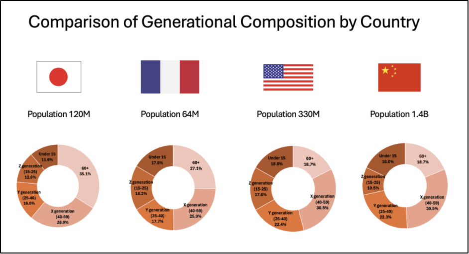
The « good » news? All models provided answers and correctly referenced the source page in the PDF. They even recognized country names based on flag images in the charts. The disturbing part? Their answers were mostly wrong.
Except for a couple of lucky hits (ChatGPT for “USA” and MS Copilot for “France”), the numbers were either mixed up between countries or shamelessly invented. Google Notebook LM went as far as reporting data for South Korea, which wasn’t even in the document. When challenged about missing data, Claude confidently claimed that certain countries were in the chart when they were not and failed to report countries that actually were.
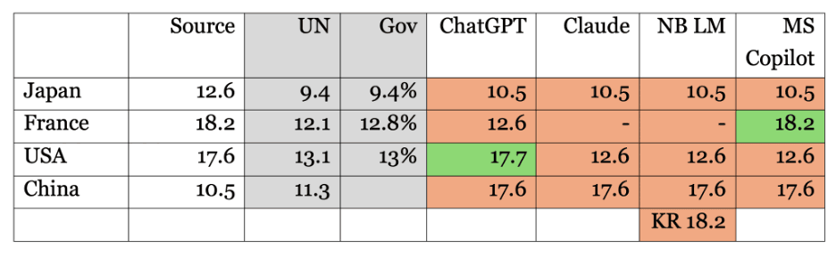
Here is a consolidated summary of bot replies enriched with the data source. We also added values from UN and government agencies to check if – contrary to our instructions – the tools were sourcing themselves on the Internet or their training set.
An Alternative Proposition
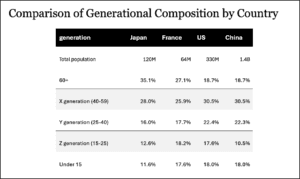
Here’s where it gets interesting. The results changed dramatically when we replaced, within the source document, the donut chart with a simple table containing the same information. ChatGPT suddenly became precise: « According to the document, the Gen Z population proportion in Japan (defined as individuals aged 15-25) is 12.6% of the total population. » When asked for a table, all figures were correct.
Why This Matters
Let’s not waste time criticizing donut charts or pointing fingers at percentages that do not add up to 100%. The real issue runs deeper. Many authors have eloquently argued against the overuse of PowerPoint (Wikipedia offers a nice summary of PowerPoint’s cultural impact). But even if you’re convinced the tool is right for you (or if you’re an addict), we must reassess its role as a knowledge base.
In the past, some individuals impressed us with their ability to remember precisely where specific information was buried, which slide deck, and in which email thread. But with GenAI, the search game has changed. Many of us – myself included – rely on computer memory to compensate for our neural limitations. And as we’ve seen, AI tools fail spectacularly when interpreting even simple graphs.
A Call to Action
We shouldn’t wait for tech giants to perfect their chart interpretation capabilities. These visualizations are based on data – actual numbers. While we should remain free to create whatever graphs we need for presentations, we must insist on access to the original data. Simply add them in the appendix. That will be our source of truth.
The next time you prepare a slide deck that might end up in a knowledge base, remember: your beautiful charts may become a source of corporate hallucination.
Plus de Alexandre Masselot

Socraft
There is a Better Way to Do PowerPoint (in the Age of GenAI)
For the better or the worse, a PowerPoint slide deck in the default medium for corporate interactions. However, in an age where Generative AI reshapes our ways of working, we ask a question (and propose a few answers): How shall we adapt our slide production and delivery to get the best out of these tools?

Socraft
Email Phishing Training Efficiency: An experiment
Are email phishing training campaigns efficient? Well, not as much as it is often claimed. We proposed to evaluate a « classic » setup with test/control populations. And then, to try another tool to see the differences.

Socraft
Integrating a Product Referential System: the REST API Proxy Pattern
Product data is key in a retailer information system. If structuring data and processes whithin in the Syndigo Product Information Management (PIM) system was a first move, we hit unexpected problems, either intrinsic to the tool or when integrating the application with the whole ecosystem. We will discuss the vendor’s PIM limitations we met and how we overcome them with a Restful API Proxy.